Time Series prediction is a difficult problem both to frame and to address with machine learning.
In this post you will discover how to develop neural network models for time series prediction in Python using the Keras deep learning library.
After reading this post you will know:
About the airline passengers univariate time series prediction problem.
How to phrase time series prediction as a regression problem and develop a neural network model for it.
How to frame time series prediction with a time lag and develop a neural network model for it.
Let’s get started.
Problem Description
The problem we are going to look at in this post is the international airline passengers prediction problem.
This is a problem where given a year and a month, the task is to predict the number of international airline passengers in units of 1,000. The data ranges from January 1949 to December 1960 or 12 years, with 144 observations.
Below is a sample of the first few lines of the file.
"Month","International airline passengers: monthly totals in thousands. Jan 49 ? Dec 60"
"1949-01",112
"1949-02",118
"1949-03",132
"1949-04",129
"1949-05",121
We can load this dataset easily using the Pandas library. We are not interested in the date, given that each observation is separated by the same interval of one month. Therefore when we load the dataset we can exclude the first column.
The downloaded dataset also has footer information that we can exclude with the skipfooter argument to pandas.read_csv() set to 3 for the 3 footer lines. Once loaded we can easily plot the whole dataset. The code to load and plot the dataset is listed below.
Get your daily lesson via email with tips and tricks.
Multilayer Perceptron Regression
We to phrase the time series prediction problem as a regression problem.
That is, given the number of passengers (in units of thousands) this month, what is the number of passengers next month.
We can write a simple function to convert our single column of data into a two-column dataset. The first column containing this month’s (t) passenger count and the second column containing next month’s (t+1) passenger count, to be predicted.
Before we get started, let’s first import all of the functions and classes we intend to use. This assumes a working SciPy environment with the Keras deep learning library installed.
import numpy
import matplotlib.pyplot as plt
import pandas
from keras.models import Sequential
from keras.layers import Dense
Before we do anything, it is a good idea to fix the random number seed to ensure our results are reproducible.
# fix random seed for reproducibility
numpy.random.seed(7)
We can also use the code from the previous section to load the dataset as a Pandas dataframe. We can then extract the NumPy array from the dataframe and convert the integer values to floating point values which are more suitable for modeling with a neural network.
After we model our data and estimate the skill of our model on the training dataset, we need to get an idea of the skill of the model on new unseen data. For a normal classification or regression problem we would do this using cross validation.
With time series data, the sequence of values is important. A simple method that we can use is to split the ordered dataset into train and test datasets. The code below calculates the index of the split point and separates the data into the training datasets with 67% of the observations that we can use to train our model, leaving the remaining 33% for testing the model.
# split into train and test sets
train_size = int(len(dataset) * 0.67)
test_size = len(dataset) - train_size
train, test = dataset[0:train_size,:], dataset[train_size:len(dataset),:]
print(len(train), len(test))
Now we can define a function to create a new dataset as described above. The function takes two arguments, the dataset which is a NumPy array that we want to convert into a dataset and the look_back which is the number of previous time steps to use as input variables to predict the next time period, in this case, defaulted to 1.
This default will create a dataset where X is the number of passengers at a given time (t) and Y is the number of passengers at the next time (t + 1).
It can be configured and we will look at constructing a differently shaped dataset in the next section.
# convert an array of values into a dataset matrix
def create_dataset(dataset, look_back=1):
dataX, dataY = [], []
for i in range(len(dataset)-look_back-1):
a = dataset[i:(i+look_back), 0]
dataX.append(a)
dataY.append(dataset[i + look_back, 0])
return numpy.array(dataX), numpy.array(dataY)
Let’s take a look at the effect of this function on the first few rows of the dataset.
X Y
112 118
118 132
132 129
129 121
121 135
If you compare these first 5 rows to the original dataset sample listed in the previous section, you can see the X=t and Y=t+1 pattern in the numbers.
Let’s use this function to prepare the train and test datasets ready for modeling.
# reshape into X=t and Y=t+1
look_back = 1
trainX, trainY = create_dataset(train, look_back)
testX, testY = create_dataset(test, look_back)
We can now fit a Multilayer Perceptron model to the training data.
We use a simple network with 1 input, 1 hidden layer with 8 neurons and an output layer. The model is fit using mean squared error, which if we take the square root gives us an error score in the units of the dataset.
I tried a few rough parameters and settled on the configuration below, but by no means is the network listed optimized.
# create and fit Multilayer Perceptron model
model = Sequential()
model.add(Dense(8, input_dim=look_back, activation='relu'))
model.add(Dense(1))
model.compile(loss='mean_squared_error', optimizer='adam')
model.fit(trainX, trainY, nb_epoch=200, batch_size=2, verbose=2)
Once the model is fit, we can estimate the performance of the model on the train and test datasets. This will give us a point of comparison for new models.
Finally, we can generate predictions using the model for both the train and test dataset to get a visual indication of the skill of the model.
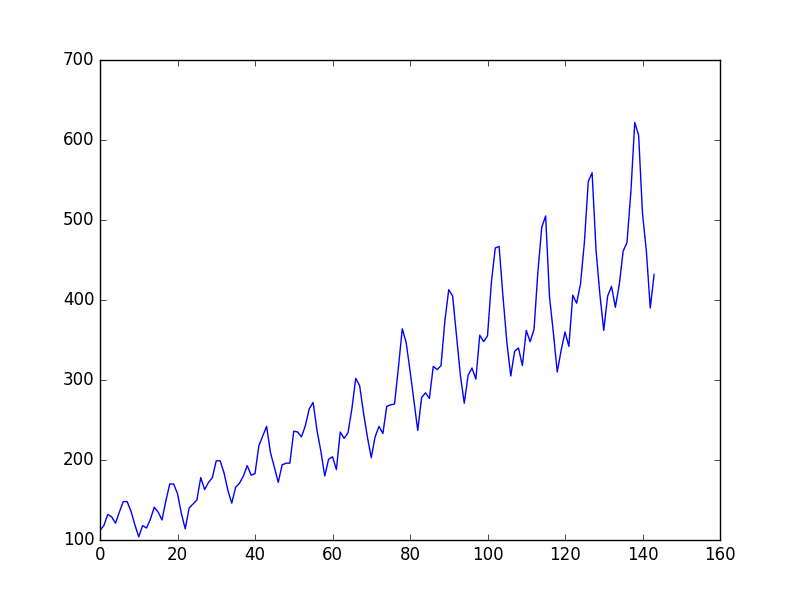
Because of how the dataset was prepared, we must shift the predictions so that they aline on the x-axis with the original dataset. Once prepared, the data is plotted, showing the original dataset in blue, the predictions for the train dataset in green the predictions on the unseen test dataset in red.
# generate predictions for training
trainPredict = model.predict(trainX)
testPredict = model.predict(testX)
# shift train predictions for plotting
trainPredictPlot = numpy.empty_like(dataset)
trainPredictPlot[:, :] = numpy.nan
trainPredictPlot[look_back:len(trainPredict)+look_back, :] = trainPredict
# shift test predictions for plotting
testPredictPlot = numpy.empty_like(dataset)
testPredictPlot[:, :] = numpy.nan
testPredictPlot[len(trainPredict)+(look_back*2)+1:len(dataset)-1, :] = testPredict
# plot baseline and predictions
plt.plot(dataset)
plt.plot(trainPredictPlot)
plt.plot(testPredictPlot)
plt.show()
We can see that the model did an excellent job of fitting both the training and the test datasets.
Number of Passengers Predicted Using a Simple Multilayer Perceptron Model. Blue=Whole Dataset, Green=Training, Red=Predictions.
For completeness, below is the entire code listing.
# Multilayer Perceptron to Predict International Airline Passengers (t+1, given t)
import numpy
import matplotlib.pyplot as plt
import pandas
from keras.models import Sequential
from keras.layers import Dense
# convert an array of values into a dataset matrix
def create_dataset(dataset, look_back=1):
dataX, dataY = [], []
for i in range(len(dataset)-look_back-1):
a = dataset[i:(i+look_back), 0]
dataX.append(a)
dataY.append(dataset[i + look_back, 0])
return numpy.array(dataX), numpy.array(dataY)
# fix random seed for reproducibility
numpy.random.seed(7)
# load the dataset
dataframe = pandas.read_csv('international-airline-passengers.csv', usecols=[1], engine='python', skipfooter=3)
dataset = dataframe.values
dataset = dataset.astype('float32')
# split into train and test sets
train_size = int(len(dataset) * 0.67)
test_size = len(dataset) - train_size
train, test = dataset[0:train_size,:], dataset[train_size:len(dataset),:]
print(len(train), len(test))
# reshape into X=t and Y=t+1
look_back = 1
trainX, trainY = create_dataset(train, look_back)
testX, testY = create_dataset(test, look_back)
# create and fit Multilayer Perceptron model
model = Sequential()
model.add(Dense(8, input_dim=look_back, activation='relu'))
model.add(Dense(1))
model.compile(loss='mean_squared_error', optimizer='adam')
model.fit(trainX, trainY, nb_epoch=200, batch_size=2, verbose=2)
# Estimate model performance
trainScore = model.evaluate(trainX, trainY, verbose=0)
print('Train Score: ', trainScore)
testScore = model.evaluate(testX, testY, verbose=0)
print('Test Score: ', testScore)
# generate predictions for training
trainPredict = model.predict(trainX)
testPredict = model.predict(testX)
# shift train predictions for plotting
trainPredictPlot = numpy.empty_like(dataset)
trainPredictPlot[:, :] = numpy.nan
trainPredictPlot[look_back:len(trainPredict)+look_back, :] = trainPredict
# shift test predictions for plotting
testPredictPlot = numpy.empty_like(dataset)
testPredictPlot[:, :] = numpy.nan
testPredictPlot[len(trainPredict)+(look_back*2)+1:len(dataset)-1, :] = testPredict
# plot baseline and predictions
plt.plot(dataset)
plt.plot(trainPredictPlot)
plt.plot(testPredictPlot)
plt.show()
Taking the square root of the performance estimates, we can see that the model has an average error of 23 passengers (in thousands) on the training dataset and 48 passengers (in thousands) on the test dataset.
Multilayer Perceptron Using the Window Method
We can also phrase the problem so that multiple recent time steps can be used to make the prediction for the next time step.
This is called the window method, and the size of the window is a parameter that can be tuned for each problem.
For example, given the current time (t) we want to predict the value at the next time in the sequence (t + 1), we can use the current time (t) as well as the two prior times (t-1 and t-2).
When phrased as a regression problem the input variables are t-2, t-1, t and the output variable is t+1.
The create_dataset() function we wrote in the previous section allows us to create this formulation of the time series problem by increasing the look_back argument from 1 to 3.
A sample of the dataset with this formulation looks as follows:
We can re-run the example in the previous section with the larger window size. The whole code listing with just the window size change is listed below for completeness.
# Multilayer Perceptron to Predict International Airline Passengers (t+1, given t, t-1, t-2)
import numpy
import matplotlib.pyplot as plt
import pandas
from keras.models import Sequential
from keras.layers import Dense
# convert an array of values into a dataset matrix
def create_dataset(dataset, look_back=1):
	dataX, dataY = [], []
	for i in range(len(dataset)-look_back-1):
		a = dataset[i:(i+look_back), 0]
		dataX.append(a)
		dataY.append(dataset[i + look_back, 0])
	return numpy.array(dataX), numpy.array(dataY)
# fix random seed for reproducibility
numpy.random.seed(7)
# load the dataset
dataframe = pandas.read_csv('international-airline-passengers.csv', usecols=[1], engine='python', skipfooter=3)
dataset = dataframe.values
dataset = dataset.astype('float32')
# split into train and test sets
train_size = int(len(dataset) * 0.67)
test_size = len(dataset) - train_size
train, test = dataset[0:train_size,:], dataset[train_size:len(dataset),:]
print(len(train), len(test))
# reshape dataset
look_back = 3
trainX, trainY = create_dataset(train, look_back)
testX, testY = create_dataset(test, look_back)
# create and fit Multilayer Perceptron model
model = Sequential()
model.add(Dense(8, input_dim=look_back, activation='relu'))
model.add(Dense(1))
model.compile(loss='mean_squared_error', optimizer='adam')
model.fit(trainX, trainY, nb_epoch=200, batch_size=2, verbose=2)
# Estimate model performance
trainScore = model.evaluate(trainX, trainY, verbose=0)
print('Train Score: ', trainScore)
testScore = model.evaluate(testX, testY, verbose=0)
print('Test Score: ', testScore)
# generate predictions for training
trainPredict = model.predict(trainX)
testPredict = model.predict(testX)

# shift train predictions for plotting
trainPredictPlot = numpy.empty_like(dataset)
trainPredictPlot[:, :] = numpy.nan
trainPredictPlot[look_back:len(trainPredict)+look_back, :] = trainPredict

# shift test predictions for plotting
testPredictPlot = numpy.empty_like(dataset)
testPredictPlot[:, :] = numpy.nan
testPredictPlot[len(trainPredict)+(look_back*2)+1:len(dataset)-1, :] = testPredict

# plot baseline and predictions
plt.plot(dataset)
plt.plot(trainPredictPlot)
plt.plot(testPredictPlot)
plt.show()
Running the example provides the following output.
We can see that the error was reduced compared to that of the previous section.
Again, the window size and the network architecture were not tuned, this is just a demonstration of how to frame a prediction problem. Taking the square root of the performance scores we can see the average error on the training dataset was 21 passengers (in thousands per month) and the average error on the unseen test set was 44 passengers (in thousands per month).
Prediction of the Number of Passengers using a Simple Multilayer Perceptron Model With Time Lag. Blue=Whole Dataset, Green=Training, Red=Predictions
Do You Want To Get Started With Deep Learning?
You can develop and evaluate deep learning models in just a few lines of Python code. You need:
In this post you discovered how to develop a neural network model for a time series prediction problem using the Keras deep learning library.
After working through this tutorial you now know:
About the international airline passenger prediction time series dataset.
How to frame time series prediction problems as a regression problems and develop a neural network model.
How use the window approach to frame a time series prediction problem and develop a neural network model.
Do you have any questions about time series prediction with neural networks or about this post? Ask your question in the comments below and I will do my best to answer.
Melissa’s talk is short, but it’s packed with wisdom and delivered in a no nonsense style that makes you think if your service is down Melissa is definitely the kind of person you want on the case.
Oh, just what is SRE? It stands for Site Reliability Engineering, but a definition is more elusive. It’s like the kind of answers you get when you ask for a definition of the Tao. It’s more a process than a thing, as is made clear by Ben Sloss 24x7 VP, Google, who defines SRE as:
what happens when a software engineer is tasked with what used to be called operations.
Let that bounce around your head for awhile.
Above and beyond all else one thing is clear: SREs are the custodian of production. SREs are the custodian of customer experience, for both google.com and GCP.
Some of the highlights of the talk for me:
The Destructive Incentives of Pitting Uptime vs Features. SRE is an attempt to solve the natural tension between developers who want to push features and sysadmins that want maintain uptime by not pushing features.
The Error Budget. This is the idea that failure is expected. It’s not a bad thing. Users can’t tell if a service is up 100% of the time or 99.99%, so you can have errors. This reduces the tension between dev and ops. As long as the error budget is maintained you can push out new features and the ops side won’t be blamed.
Goal is to restore service immediately. Troubleshooting comes later. This means you need a lot of logging and tooling to debug after a service has been restored. For some reason this made flash on a line from an earlier article, also based on a talk from a Google SRE: Backups are useless. It’s the restore you care about.
No Boredom Philosophy of Paging. When a page comes in it should be for an interesting and new problem. You don’t want SREs being bored handling repetitive problems. That’s what bots are for.
Other interesting topics in the talk are: How is SRE structured organizationally? How are devs hired into a role focussed on production and keep them happy? How do we keep the team valued inside of Google? How do we help our teams communicate better and resolve disagreements with data rather than with assertions or power grabs?
Let’s get on with it with it. Here’s how Google does Planet-Scale Engineering for a Planet-Scale Infrastructure…
Editor’s note: this post is part of a series of in-depth articles on what’s new in Kubernetes 1.3 Kubernetes Dashboard is a project that aims to bring a general purpose monitoring and operational web interface to the Kubernetes world. Three months ago we released the first production ready version, and since then the dashboard has made massive improvements. In a single UI, you’re able to perform majority of possible interactions with your Kubernetes clusters without ever leaving your browser. This blog post breaks down new features introduced in the latest release and outlines the roadmap for the future. Full-Featured Dashboard Thanks to a large number of contributions from the community and project members, we were able to deliver many new features for Kubernetes 1.3 release. We have been carefully listening to all the great feedback we have received from our users (see the summary infographics) and addressed the highest priority requests and pain points. The Dashboard UI now handles all workload resources. This means that no matter what workload type you run, it is visible in the web interface and you can do operational changes on it. For example, you can modify your stateful MySQL installation with Pet Sets, do a rolling update of your web server with Deployments or install cluster monitoring with DaemonSets.
Home screen that shows all workloads running in a cluster.
In addition to viewing resources, you can create, edit, update, and delete them. This feature enables many use cases. For example, you can kill a failed Pod, do a rolling update on a Deployment, or just organize your resources. You can also export and import YAML configuration files of your cloud apps and store them in a version control system.
YAML resource editor and exporter.
The release includes a beta view of cluster nodes for administration and operational use cases. The UI lists all nodes in the cluster to allow for overview analysis and quick screening for problematic nodes. The details view shows all information about the node and links to pods running on it.
Node view that lists its details and Pods running on it.
There are also many smaller scope new features that the we shipped with the release, namely: support for namespaced resources, internationalization, performance improvements, and many bug fixes (find out more in the release notes). All these improvements result in a better and simpler user experience of the product.
Future Work
The team has ambitious plans for the future spanning across multiple use cases. We are also open to all feature requests, which you can post on our issue tracker.
Here is a list of our focus areas for the following months:
Handle more Kubernetes resources - To show all resources that a cluster user may potentially interact with. Once done, Dashboard can act as a complete replacement for CLI.
Monitoring and troubleshooting - To add resource usage statistics/graphs to the objects shown in Dashboard. This focus area will allow for actionable debugging and troubleshooting of cloud applications.
Security, auth and logging in - Make Dashboard accessible from networks external to a Cluster and work with custom authentication systems.
Connect With Us
We would love to talk with you and hear your feedback!
Modern object recognition models have millions of parameters and can take weeks to fully train. Transfer learning is a technique that shortcuts a lot of this work by taking a fully-trained model for a set of categories like ImageNet, and retrains from the existing weights for new classes. In this example we’ll be retraining the final layer from scratch, while leaving all the others untouched. For more information on the approach you can see this paper on Decaf.
Though it’s not as good as a full training run, this is surprisingly effective for many applications, and can be run in as little as 75 minutes on a laptop, without requiring a GPU. This tutorial will show you how to run the example script on your own images, and will explain some of the options you have to help control the training process.
Let’s reshape the train.csv data from Kaggle with this script to jpegs
Here is the data reshaped as jpegs sitting in the zero folder
Which got me wondering… are there any apps out there that let me detect the MAC address of Bluetooth devices in my vicinity, and is there anyone aggregating the data, perhaps as a quid pro quo for making such an app available?
Seems like the answer is yes, and yes…
For example, John Abraham’s Bluetooth 4.0 Scanner [Android] app will let you [scan] for Bluetooth devices… The information is recorded includes: device name, location, RSSI signal strength, MAC address, MAC address vendor lookup.
In a spirit of sharing, the Bluetooth 4.0 Scanner app “supports the earthping.com project – crowdsourced Bluetooth database. Users are also reporting usage to find their lost Bluetooth devices”.
So when you run the app to check the presence of Bluetooth devices in your own vicinity, you also gift location of those devices – along with their MAC addresses – to a global database – earthping. Good stuff…not.
We’re all familiar (at least in the UK) with surveillance cameras everywhere, and as object recognition and reconciliation tools improves it seems as if tracking targets across multiple camera views will become a thing, as demonstrated by the FX Pal Dynamic Object Tracking System (DOTS) for “office surveillance”.
It’s also increasingly the case that street furniture is appearing that captures the address of our electronic devices as we pass them. For example, in New York, Link NYC“is a first-of-its-kind communications network that will replace over 7,500 pay phones across the five boroughs with new structures called Links. Each Link will provide superfast, free public Wi-Fi, phone calls, device charging and a tablet for Internet browsing, access to city services, maps and directions”. The points will also allow passers-by to ‘view public service announcements and more relevant advertising on two 55” HD displays’– which is to say they track everything that passes, tries to profile anyone who goes online via the service, and then delivers targeted advertising to exactly the sort of people passing each link.
LinkNYC is completely free because it’s funded through advertising. Its groundbreaking digital OOH advertising network not only provides brands with a rich, context-aware platform to reach New Yorkers and visitors, but will generate more than a half billion dollars in revenue for New York City.
So I wondered just what sorts of digital info we leak as we do walk down the street. Via Tracking people via WiFi (even when not connected), I learn that devices operate in one of two modes – a listening beacon mode, where they essentially listening for access points, but at high battery cost. Or a lower energy ping mode, where they announce themselves (along with MAC address) to anyone who’s listening.
If you want to track passers-by, many of whom will be pinging their credentials to anyone whose listening, you can set up things like wifi routers in monitor mode to listen out for – and log – such pings. Edward Keeble describes how to do it in the post Passive WiFi Tracking…
If you’d rather not hack together such a device yourself, you can always buy something off the shelf to log the MAC addresses of passers-by, eg from somebody such as Libelium’s Meshlium Scanner [datasheet – PDF]. So for example:
Meshlium Scanner AP– It allows to detect (sic) Smartphones (iPhone, Android) and in general any device which works with WiFi or Bluetooth interfaces. This model can receive and store data from Waspmotes with GPRS, 3G or WiFi, sending via HTTP protocol. The collected data can be send (sic) to the Internet by using the Ethernet.
Meshlium Scanner 3G/GPRS-AP– It allows to detect (sic) Smartphones (iPhone, Android) and in general any device which works with WiFi or Bluetooth interfaces. This model can receive and store data from Waspmotes with GPRS, 3G or WiFi, sending via HTTP protocol. The collected data can be send (sic) to the Internet by using the Ethernet, and 3G/GPRS connectivity
Meshlium Scanner XBee/LoRa -AP– It allows to detect (sic) Smartphones (iPhone, Android) and in general any device which works with WiFi or Bluetooth interfaces. It can also capture the sensor data which comes from the Wireless Sensor Network (WSN) made with Waspmote sensor devices. The collected data can be send (sic) to the Internet by using the Ethernet and WiFi connectivity.
So have any councils started installing that sort of device I wonder? And if so, on what grounds?
On the ad-tracking/marketing front, I’m also wondering whether there are extensions to cookie matching services that can match MAC addresses to cookies?
I moved from Boston to the Bay Area a few months ago. Priya (my girlfriend) and I heard all sorts of horror stories about the rental market. The fact that searching for “How to find an apartment in San Francisco” on Google yields dozens of pages of advice is a good indicator that apartment hunting is a painful process.
Boston is cold, but finding an apartment in SF is scary
We read that landlords hold open houses, and that you have to bring all of your paperwork to the open house and be willing to put down a deposit immediately to even be considered. We started exhaustively researching the process, and figured out that a lot of finding an apartment comes down to timing. Some landlords want to hold an open house no matter what, but for others, being one of the first people to see the apartment usually means that you can get it. You eneed to find the listing, quickly figure out if it meets your criteria, then call the landlord to arrange a showing to have a shot.
I’ve been thinking a bit why corporate america can be a painful place to be. The reason I’ve been thinking about it is sooooo many people are trapped by it, and are unhappy, and it would be great if we can slowly start to make things better. All I really know to do right now is talk about it.
Most of my experience with the corporate world involves startups in various failure-modes, and occasional intermittent (if sometimes short lived) success modes. But also some large companies, in states of just being large companies. Many of those times had islands that were quite good. And I shouldn’t forget that - but they are hard to find and sometimes brief.
But one thing I’ve noticed that a lot of executives tend to talk the same. Pretty much all venture capitalists DO talk he same (it’s freaky, and Silicon Valley on HBO is a documentary, but it’s weirder than that). And there are very few really innovative ideas out there, many more ideas that come from the idea of seeing “this previous idea looked successful, now how do I do something easy and slightly similar and try to make a quick buck before this explodes”. And there’s usually the feeling that cool ideas can’t rise up from the bottom, because there needs to be a power structure. And I feel a lot of times, people running these entities didn’t have the souls that I thought they could have, and the people in these machines weren’t as happy as they could be. And I’m not sure why.
Was the fact that basically all companies seemed to follow the same models a cause of their eventual suffering? Given, I’m not that person that wants to copy a previous corporate plan or way of acting. Foremost, I want to help people, and I like building things that matter. And I believe corporations should really be about the people who work for them - I believe in equal pay through the ranks as much as possible, for instance. That’s controversial. But most companies copy the way other companies work, and have people with specific titles and decisions get made in specific ways.
When I say everybody seems to think alike, let me borrow a phrase that was once used against me long ago - the idea of “playing company”. Often, we try to simulate things because that is the way things were done somewhere else, or that’s how people do those certain things. This isn’t limited merely to corporate interactions, but can also affect the way we plan things, the way we email, the phrases we use and so forth. While completely ignoring the issues of human diversity (which are important, problems with the idea of “culture fit” in particular), we have a very low idea in tech of what I might call “thought diversity”. Exciting ideas are frequently smacked down as crazy, when they might not be crazy at all. We have come to favor mediocre success rather than a chance at greatness. And this results in some really boring apps being produced that don’t really improve society, and a lot of junk being peddled as snake oil along the way as well. And these junk ideas get millions of dollars in fundraising and do sell products to companies. Why? Everybody knows it’s junk, but the people working there have to eat. A lot can be done with pure force of will.
The system tends to want all businesses to operate the same way, to explode to insane levels of size, and often, achieve mediocrity in following a path that is not right for them.
This leaves me feeling that the true america is far away from the corporate structure, and small business still has a heart, and this is what we should be striving for, rather than corporate structures.
People in companies of course can too have hearts, and many do, but it would be inaccurate to say a corporate is really a group of people with a common goal. Most people in a corporation have the “work together to make the world a better place” pretty far down the list, because they are looking out for families, or personal ego fulfillment, and this often comes at the cost of internal maneuvering and power plays. I have somewhat thought that today’s corporate structure is kind of a meta-game to simulate feudal wars of Medieval Europe.
We don’t want this. We really want a “Star Trek” era world, post-currency, post-competition. Of course, that is what most people would quickly write off as crazy talk.
So, yeah, this intro has been a long tangent - but what I have said above is businesses pretend to copy the way businesses have functioned *before*.
If we are to believe these cultures flow top-down (not always the case, but it’s a factor), one of the problem is everybody is reading the same books and isn’t really experimenting.
The number of times I’ve heard phrases like “Crossing the Chasm” kind of makes me what to throw up sometimes.
So, without further ado, some startup reading that isn’t on the official approved reading list and some lessons from them.
This is about innovation, but also the struggles of trying to be innovative in the context of such a corporate structure that doesn’t really know how to be.
1. Ender’s Game
Ender’s Game named one of my products. I didn’t pick it for this reason, but one of the cool lessons of Ender’s Game involves empathy as a strategic weapon.
In the moment when I truly understand my enemy, understand him well enough to defeat him, then in that very moment I also love him. I think it’s impossible to really understand somebody, what they want, what they believe, and not love them the way they love themselves. And then, in that very moment when I love them…. I destroy them.
Not only must you truly know and love your user as well as they love themselves to build great products, you must think like your competition. And when you do so, you are likely to feel badly for them while they are being dissolved. There are a few basics here - see what they are not building, see the wrong things they are building, see their overhead and how they think of themselves, and do what they are afraid to do, or so caught up by overhead that they cannot do.
Ender’s battles weren’t just with aliens, but they were also with administrators and commanders. In any organization, many will work against you. Leaders will be ineffective because of ego issues. To get past them, you must also have empathy for these people, to know what they think and what they want.
Another aspect of Ender’s game that has merit is the way he encouraged Bean to experiment with crazy ideas, ideas that later won him battles. Experimentation and allowing for failure - rather than preliminary crushing of ideas that don’t work - is the way cool things happen - and that’s the way real winning happens.
2. Dune, books 1-6.
A few key things. As I’ve talked about before, Dune introduces the idea of mentats, quite literally “human computers”, a consequence of a time where computers were outlawed to protect humanity from dangerous AI (never mind that, Alexa still doesn’t understand me most of the time). Mentats are stronger the more data they have, and they follow the data to do the right thing. Many times in the past, I’ve been deprived of data, and as a result, I have not been able to make my best decisions. Really everyone is in the best position when everyone has the data, as you want everybody in your company to know the user (and the competition) as good as they possibly can. When someone tries to deprive you of data, you can instantly tell someone wants to keep you in the dark, and they are not your friend.
There’s also the concept of “The Golden Path”. Enhanced with powers from overdose on spice (which I think means Bojangles Sweet Tea) and selective genetics, both Paul and Leto gain precognition. They use this not for s short term events, but to see far in the future. Their goal is not personal gain, but the survival of humanity.
For a business to succeed, you have to think very very far ahead. You have to see all the potential moves from a decision, many moves ahead, and anticipate the possible moves of your competition.
This is especially difficult when others are not always looking as far forward, or don’t have the background (or genetics, or spice) to do so. One has to fight both external and internal forces to achieve a desired outcome. Such outcomes are not easy, and often require sacrifice, such as when Leto destroyed his own empire on purpose to increase diversity of ideas throughout the universe - quite necessary for the survival of humanity against future threats.
Take this with a huge blinking caution sign above it though - when the meta-game of steering a business is gone, living this far in the future and always being in defense mode is a pretty good recipe for some epic levels of anxiety, as you start to analyze some problems that probably *aren’t* life threatening. Not everybody can do it. Most people should not.
This brings up another key part of Dune, the “Litany against Fear” - because that same fear can personally destroy you. When you are trying to dodge every bullet, you can’t really build what you are trying to build, you are reacting, you are afraid.
There’s a shift that happens in this future-forecasting. In the beginning, you are trying to see the future to see what you could do, what territory you could take, what in the universe hasn’t been built. Once a company gets large enough, there’s pressure to just keep it from exploding. And again, if you’re the only person who can see the threats flying at you, it’s incredibly stressful trying to get others who don’t believe you to avoid them and what to focus on.
3. Some Phillip K. Dick.
I grew up reading a lot of Asimov and Clarke, and in later years, still like Clarke, and found Asimov to be a little dry. All being said, there’s a reason so many Hollywood movies come from Phillip K. Dick - he was crazy inventive, and his short stories are really pretty wild stuff.
We can take a good management lesson from “Beyond Lies the Wub”, where there is a sentient species that has an unusual property. Whatever eats the wub becomes the wub.
The moral of the story here is we become what we eat and accept. A bad hire that becomes political will destroy your company by making it political. Caution must be applied strenuously for what policies you accept, what things you do, what things you tolerate. You may have already started off on a bad foot very early on, and it can be very hard to steer something back once it has already started to drift astray.
Finally, let’s keep it positive though - imagination matters. How many business books you’ve read does not. You want to create and build new things, and should also consider new company structures. Look to the ideals of science fiction and how they can reflect on society, not to how everybody else has gone before and copied the way some large corporation or rich guy used to do it.
The magic of technology is it can be used to make anything - keep it magical. Don’t let any part of your organization crush your imagination and get you stuck in mundane drudgery. Build big things, and don’t sweat the small stuff. And by all means if someone is on you about your font choices or CSS colors throw them out the window as nicely as possible.
4. HP Lovecraft
Finally, it’s probably (this is just probability, sorry) going to be end in a bad way — but hey, it might not! Realize this is the way the universe has intended, and it’s inevitable. The old gods don’t really hate you, it’s that they just don’t care so much, so do the best with the time you’ve got. Your whole business idea might get completely eaten by a very big fish!
But also an important thing to do is look around you, and see if you are with an organization you really want to help. If you find yourself in a place where everyone seems committed to raising an ancient sea monster from the deep, you have the option of leaving, there is probably some requirement on the number of acolytes in the summoning circle and your leaving may delay his alarm clock. You don’t have to help summon it, you can leave.
Alternatively, you can work on building some giant fighting robots. But that’s more Pacific Rim or Voltron, isn’t it? But so much cooler.
5. Lord of the Rings
The battle for success in the software world, particularly a startup world is a very very long slog.
There are a lot of bleak moments punctuated with some very happy moments. Like that singing Bombadil chap. But also some singing happy moments when you realize those singing happy people you meet aren’t going to help you, and you have to be your own super hero and carry on. But also that there are some literal angels around there, who actually are there to help, if only their super power is looking really good in a robe and having a giant flashlight - but they always won’t be around either, because they are on vacation in the tropics or something.
There’s probably going to be a rotating eye of Sauron that occasionally stares at you, and you’re always trying to get away from the gaze of it.
You must do everything you can to make sure Sauron doesn’t win, and at the end of things, your town may lie in ruins, and you may think “is that all there is”, but there is the fact that you might have just possibly saved the world.
More so the lesson is it is very very hard, but it doesn’t really require a lot of skill.
You can be a Hobbit. Frodo was basically faking it the whole time, and he made it. It just requires a lot of perseverance. But there’s a huuuuge cost and amount of effort involved. We shouldn’t glorify startups all of the time, the cost is epic. If the battle you are facing isn’t quite as important as the quest of the Fellowship, I would urge you to consider maybe not undertaking, or at least, really deciding if you want to undertake it. But if you do, leaving the shire is going to be an interesting journey.
Who even knows what’s going to happen after you get back?
Recently, the shop moved a few blocks away. Business has dropped. This often happens when a mom and pop relocates. While relocation is publicly celebrated as a victory–against a greedy rent hike, for example–or a sign of resilience, it can actually be a death sentence. In my many years writing this blog, I’ve talked with several small business owners who relocate–even nearby–and then are forced to shutter in just a few years.
I asked Beth a few questions about life as a small business owner in the Village.
A: How long have you run a small business in Greenwich Village?
A: My sister Amy and I opened Greenwich Letterpress in 2005 at 39 Christopher Street in the West Village. This past March we re-located up the block to 15 Christopher Street.
Q: How have you seen the neighborhood changing and how has that impacted the small business landscape, for you and your neighbors?
A: We grew up in New Jersey, and as kids sneaking off to the city during the 90s, it wasn’t because The GAP in the city was better than The GAP in Willowbrook Mall. It was because the Village/West Village had the most diverse and eclectic mix of stores.
You could start on Broadway and (affordably) shop your way back to the Christopher Street PATH station and wind up with the coolest pair of sneakers, a Smiths t-shirt, a chessboard, vintage salt and pepper shakers, an import CD, and an obscure art book. The Village was the place you visited when you wanted to escape the conventional and familiar of the suburbs. That’s why we opened the kind of shop we did in this neighborhood, to be part of that Village landscape.
Not long after we opened, we realized just how real the “boom” of Bleecker Street was and how it was trickling into the rest of the neighborhood. Where once stood small indie stores were now empty spaces sitting for years, seemingly waiting for a business that could afford $15,000 or more a month for 400 square feet. You could see the spirit of the Village vanishing.
Over the past decade we have seen beloved customers move out of the neighborhood and the city, due to rent increases. Most notably: A friend of ours talking us through the Bleecker Bob’s store closing, that she was tied closely to, and begrudgingly moving uptown. The stores we would send tourists to when they wanted to visit “other places like ours” shutting their doors. Single families (and investors) taking over brownstones that used to house several families, cutting into the actual population living in the West Village. And empty storefronts becoming a normal part of the view because asking rent was 30k+ a month. Even Barnes & Noble, Gray’s Papaya, and most recently Urban Outfitters shuttering on 6th Avenue. If those places can’t afford the Village, who can?
Q: What made you move to a new location? What’s been the result of that move, in terms of business?
A: We jumped on the chance to move for several reasons. We had put an obscene amount of work into our old space over the years, even though by looking at the building you would never know it, and we couldn’t continue to make improvements that we knew would only increase the value of the space for the landlord. Time and time again, we would renovate only to have our work destroyed by ongoing floods and plumbing issues that were never really addressed, as well as structural and aesthetic blemishes that were out of our reach and control to fix.
Then there is. of course, the rent–that after a decade crept up to a place that we could no longer justify paying as a small business.
We found out about a space becoming available down the street in a building with a landlord that was sympathetic to small businesses and a management company that wasn’t gouging its tenants. We jumped on the rare opportunity. The move has been challenging. We sacrificed two large street-level windows into the shop for a first-floor walkup with two small windows. We got a few months out of our “we moved” posters before the listing real estate agent tore them down in the old space. We keep hearing the “sorry you closed,“ despite our best efforts to post that we only moved.
Q: What challenges have you faced as a small biz in the city?
A: The obvious challenge is the fact that we need to sell a huge number of products in order to simply pay our rent. This necessitates having a large and broad-based clientele visiting us daily.
Coming into a historic district over a decade ago, we certainly were aware of the desire to preserve the facade of the old Village. Unfortunately, for many small businesses, it does come at a cost. For instance, the simple act of putting a hanging sign above our business to let customers know we still exist has become a four-month process, with countless back-and-forth emails with the various building commissions (luckily we have our landlord and the building management company on our side with us).
We completely understand the desire to keep the integrity of the neighborhood, but also would like to hope that the various commissions would see the struggle of small businesses. We still are not allowed to put up a sign letting people know we are here, and this does have an impact on the number of customers we get. At the end of the day, we sometimes throw our hands up and wonder who out there do you turn to for help or understanding?
The new plight of the small business owner in New York City is that, more and more, you feel alone in this, because it’s a shrinking club and the membership fees are too high.
Beth is right. Small businesses are the neglected underdog in a city that explicitly favors corporations and chains. Currently, there are no protections for small businesses–no commercial rent control, which the city enjoyed for years after World War II, no Small Business Jobs Survival Act, no ordinance to stop the spread of chain stores, no penalties for landlords who evict and then warehouse empty storefronts, creating ”high-rent blight.“
All of the above are possible solutions–some are being implemented in other cities–yet New York’s City Hall and City Council will have none of it.
Facebook Artificial Intelligence Research laboratory open-sources the Torchnet project to package and optimize boiler plate deep learning code for reuse and plugin-ability.
Audio product from Voctro Labs provides a method of style transfer for sound, taken spoken lines and turns them into singing (note that the video below was released in January earlier this year):
“What if Michael Jackson could still record brand new songs? What if
non-singer celebrities could effortlessly record a song in any style?
What if we could have any legendary actors or celebrities say anything
without actually recording it?
WowTune VR’s world-class team of scientists and entrepreneurs has
developed a unique patented technology – based on sound processing and
machine learning – that makes “these miracles” and others possible.
Indeed, from just a few original voice samples, WowTune VR’s technology
can re-create the very singing or spoken voice of anyone. WowTune VR’s
core technology stems from years of R&D in singing and spoken voice
synthesizing – and is at the forefront of a still untapped market: VR’s
human voice.”
Today, we are excited to announce that Docker for Mac and Docker for Windows are graduating from beta and are now stable and ready for production.
We want to give a big thank-you to the tens of thousands of developers and system administrators who helped us find bugs and came up with ideas for tweaks and improvements.
Our goal with Docker for Mac and Windows is simple – create the easiest way to use Docker on your dev machine. And users tell us we delivered! Improvements include:
Faster and more reliable– native development environment using hypervisors built into each operating system. (No more VirtualBox!)
Improved Docker tools integration– all the Docker tools you need to develop locally are bundled in the app.
Improved development flow– Volume mounting for your code and data, and easy access to running containers on the localhost network. In-container debuggingwith supported IDEs also help you live debug projects, and iterate code quicker with less effort.
Enterprise network supportthat lets Docker for Mac and Windows work easily with VPNs.
All the new features available in Docker Engine 1.12.
Automatic updates, with different channels for stable and beta.
Docker 1.12
And speaking of 1.12, there’s a whole other post on the architecture and features in Docker 1.12, but here’s a quick recap:
Easy to use built-in orchestration, try it with docker swarm init
End-to-end encryption, secure by default
Services: replicated, distributed, load balanced processes running on a swarm of Engines
Stable and Beta Channels
With Docker for Mac and Windows maturing and widely adopted, we want make sure that it’s a reliable and dependable tool. But we also want to keep up the rapid pace of innovation and progress that Docker for Mac and Windows beta users have come to know and love over the past months.
So starting today, Docker for Mac and Windows are available from 2 channels – stableand beta. New features and bug fixes will go out first in auto-updates to users in the beta channel. Updates to the stable channel are much less frequent and happen in sync with major and minor releases of the Docker engine. Only features that are well-tested and ready for production are added to the stable channel releases.
If you want the latest and greatest Docker experimental builds, use the beta channel. If you want fewer updates and can wait until new features and enhancements are tested and production-ready, use the stable channel.
If you are currently a beta user, your Docker for Mac or Windows install will remain on the beta channel, and be automatically updated with future beta releases. To switch to the stable release, simply download and run the stable installer.
If you want to try the beta releases and help by giving us feedback, download the beta installer here
Upcoming documentary by Anne Ferrero explores the current independent gaming scene in Japan:
The Japanese video game industry lead the world in creativity and
innovation from the 1980’s to the mid-2000’s, but in recent years, Japanese studios had been unable to keep up with advancements in
technology, and many have shifted focus away from risky projects and unique gaming experiences.
All around the world, many players long to play games like those that inspired and excited them in their childhood. For industry veterans and young talents who aspire to the pursuit
of originality and creative freedom, going independent is the answer.
Japan has a history of independent creators building lively
communities, even within industries where large media companies rule. Comic Market, and events like it attract more than 1 million attendees yearly.
For the last several years, the Japanese game industry has begun
to recognize the power of independent creators and the momentum of the
fledgling scene, and in 2013, the Tokyo Game Show created a pavilion to feature indie creators for the first time in its history.
But is the Japanese game industry really changing?
What is the price of creative independence?
Why is there no funding or support from the Japanese government?
These are just some of the questions we examine, to understand not only this unique scene, but its roots in culture.
The answers tell a story of a struggle, not only for creative expression, but for survival as well.
To mark each mid-year and end of year milestone I try to take a reflective glance over the previous 6 months period in the data visualisation field and compile a collection of some of the most significant developments. These are the main projects, events, new sites, trends, personalities and general observations that have struck me as being important to help further the development of this field.
Earlier in the year I published a collection for the latter 6 months of 2015 and now I’d like to reflect on the first 6 months of 2016. I look forward to hearing from you with suggestions for the developments you believe have been most significant.
And so, as ever, in no particular order…
1. Climate spirals
Produced by Dr Ed Hawkins, Climate scientist at the University of Reading, this animated spiral plot of global temperatures since 1850 to date went viral on social media, providing what some observers described as the most compelling illustration of the dramatic changes in our climate.
2. PolicyViz podcast
Whilst the PolicyViz podcast, hosted by Jon Schwabish, has been going for over a year, I feel it is has really established deserved prominence across the field over the past 6 months in particular. Jon is a natural, charismatic host and interviewer and he has developed a terrific rhythm, both within the episodes – through the style, angle and pace of the conversations – and between episodes – skilfully navigating around his Rolodex of contacts to cover the field’s diversity from all angles. He’s also landed some major names rarely heard elsewhere, with appearances from Edward Tufte and William Cleveland to mention just a couple. At roughly 20/25 minutes in length it offers a bite-sized companion to the enduringly popular Data Stories episodes that tend to be closer to 60 minutes in duration.
3. Lisa Rost
Lisa is a Knight-Mozilla OpenNews fellow in the NPR visuals team, based in Washington, DC. Whilst I’ve been aware of Lisa and her work long before this recent period, it is certainly over this last 6-months that she has become increasingly prolific and visible in her contributions to discourse around the subject. Just two contrasting examples of her outputs include (1) a truly wonderful piece of work comparing the task of creating the same chart in 12 different tools and using 12 different libraries and (2) during her time at NPR she is blogging every single day about her work. I also loved this comparison of the latitudes of notable cities across the planet’s continents.
4. Polygraph
Polygraph is not new to me but I feel the quality and ‘interestingness’ (genuine word) of work emerging from Matt Daniels and his team of collaborators during 2016 has been really superb. The purpose of Polygraph is to offer “a publication that incites water cooler discussion about complex topics”. What separates their from many others, in my opinion, is the clarity of the core curiosities that drive their fascinating array of data-driven investigations into subjects around popular culture, looking into subjects like the evolution of music taste, Hollywood’s gender divide and its effects on films and the most timeless songs of all time. There is a terrific Data Stories episode 74 profiling and discussing Matt’s work.
5. Lena Groeger’s ‘Visual Evidence’ articles
For eagle-eyed readers of my site, it will come as no surprise to hear I am a huge fan of Lena Groeger’s thinking around data vis. I’ve celebrated her work in previous review posts (2014, 2015) and have included her again this time because of her excellent new series of astute, long-form ‘Visual Evidence’ articles(Update: Flipboard collection also here) where she goes in to depth about quite niche slices of interest about ‘data and visual design in everyday life’. Put the kettle on, make yourself a cuppa and set aside some time to read them.
6. Spies in the Skies
This is already an award-winning data journalism project by Peter Aldhous and Charles Seife of Buzzfeed News, analysing the patterns of U.S. government aircraft, piloted by agents of the FBI and the Department of Homeland Security (DHS), that routinely take to the skies over American cities. As the project article explains “the government’s airborne surveillance has received little public scrutiny — until now. BuzzFeed News has assembled an unprecedented picture of the operation’s scale and sweep…”. It has justifiably received many plaudits from across the spectrum of commentators for hitting that sweet-spot again of excellence in data handling, compelling angle of investigation and terrific visuals.
7. Makeover Monday
This has been a super concept developed by Andy Kriebel and Andy Cotgreave based on a weekly challenge to take the data from an existing project and invite the Tableau community to propose makeover redesigns to explore the different potential creative avenues. Over the course of the year it has grown a loyal and committed following of people creating redesigns of works, importantly, in the entirely appropriate spirit of constructive critique rather than unsubstantiated criticism.
8. Pie chart studies
Co-authored by Robert Kosara and Drew Skau, some important new research about pie charts. “Pie charts? Don’t we know everything about why pie charts are evil and really dumb?”, might be the words uttered by a few. However, this work is really significant because, in response to the question “do we know how we read pie charts? Is it actually angle, as is usually claimed, or is it really arc length or maybe area?”, Robert and Drew discovered that there was no actual research to back up the claims that it was indeed angle. Furthermore, “the common wisdom about how we read these charts is almost certainly wrong, and that things are much more complicated than we thought”. The pair of research papers looked at (1) ‘Arcs, Angles, or Areas: Individual Data Encodings in Pie and Donut Charts’ and (2) ‘Judgment Error in Pie Chart Variations’.
9. Interactive approaches at the (New York) Times, they are a changin’
When any folks from the New York Times speak, you listen and you learn, but when Archie Tse speaks at Malofiej 24, and the title of his talk is about ‘Why we are doing fewer interactives?‘, you really know it is time to listen and learn. I wasn’t there to watch this talk, let me establish that upfront, but it is clear from the contents that this is something significant. I’m not going to repeat the main takeaways from this, just go through it yourself (it is quite short) and you’ll learn about ‘three rules for visual storytelling’ and the main ways the NYT graphics team are changing their approach to creating the types of experiences their users are clearly demanding/responding to.
10. Data Journalism’s ‘Dirty little secret…’
On the topic of newspaper based visual journalism, this article by Christopher Ingraham on the Wasington Post’s Wonk Blog really struck a chord with me. It talks about the ‘veneer of authority and objectivity’ that numbers and graphical representations can convey to readers, despite the fact that, as makers of these things, we introduce so many subjective decisions about what to show, what to include and how to show it.
Special mentions…
Here are the other highlights from the first half of 2016 that deserve a special mention:
Kennedy Elliott’s OpenVis talk | Whilst we are discussing the Washington Post, two more special mentions for their work/colleagues. Firstly, this super interesting talk/article created by Kennedy discussing her reflections on investigating ’39 studies about human perception’.
NFL Draft History | Secondly (or should it be thirdly), this incredibly in-depth, highly customisable and hugely varied analysis of the NFL’s draft history.
FT’s changing approach | I already noted the changes and quality of visualisation work coming out of the FT in last year’s 6-monthly review but this is a really nice account, a few months on, of the changes being made, in particular, since the arrival of Alan Smith to the team.
Chriming | Just a beautiful piece of work by Seoul-based Sook Ko visualising bird song through the metaphor of branches, trees and forests.
Nadieh Bremer | Like Lisa, mentioned above, Nadieh is a (self-described) ‘Astronomer-turned-Data-Scientist-turned-self-taught-Data-Visualization-Designer’ who has been very active and visible this year, producing a wide range of fascinating visual projects, tutorials, talks and resources reviews.
WSJ’s Hamilton | A really innovative piece about the musical “Hamilton” and looking at “how some of the most densely packed, complex rhyming lyrics in the history of musicals actuallyl work”.
Nicholas Rougeux | Nicholas is another designer who has really appeared consistently on my radar in recent months with his interesting, inventive and wonderfully elegant visualisation explorations.
Flag Stories | A very simple subject in theory but a super nice and super dense array of visual analysis studying the attributes of the flags of the world, created by Denmark-based studio, ferdio
DevOps transformation projects are increasingly appealing to established enterprises. InfoQ spoke to three businesses focused on DevOps consulting to understand how they are helping businesses make the change.
Given the recent news of the final production of VHS recorders in Japan, I recommend this documentary which illustrates the power of the medium. It tells the story of how illegal copies of Western films became distributed through Communist Romania, how one translator became an anonymous hero, and how the stories inspired a nation:
Highly recommended - should be available on Netflix.
Related is this video essay by
Aleksandra Domanović called Turbo Sculpture, discussing how western pop culture had an impact in ex-Yogoslovian republic public art:
Should the Docker container image format be completely standardized? Or should Docker not be held back from evolving the format ahead of the open specification? This was the topic of a heated Twitter tussle last week between Google evangelist Kelsey Hightower and the creator of the Docker itself, Solomon Hykes.
Hightower wants to see the Docker format image to be completely standardized, so companies, including Docker, can build additional functionality atop of the specification. Hykes, however, balked at full standardization, asserting that the format is still too new and evolving too quickly.
The debate centers around how much Docker should donate of its container technology to the Open Container Initiative (OCI), an initiative to build a vendor-neutral container image and runtime specification. The image is the package, or the container itself, which users can fill with their apps. The runtime is the engine that runs the container, providing all the support of the underlying OS.
Last week’s release of Apache Mesos version 1 had seemingly kicked off the debate, when Hightower, commenting on the release, wondered which company was the first to release third-party software that could run Docker containers (Joyent was, he later reported).
Ideally, he argued through Twitter, running a container image should not be limited to any specific runtime. “The Docker Image format has been a great unifier in the container space, but will only reach its maximum potential if they can run anywhere,” he wrote.
Hykes had then chimed in, in a series of Tweets since-deleted Tweets (screen captured by Hightower), that any third-party companies that claim to support the Docker container format only offer a subset of the full capabilities, and that users relying on these third-party applications may have some functionality go missing.
Hykes also dismissed the OCI container format as a “fake standard,” one that, at best, could only act as an intermediate format. To Hightower, this was a surprising admission given that to date, Docker has supported the OCI work, and has been public in doing so. But Docker is iterating on the Docker format so quickly that standardizing the work would slow innovation, Hykes argued.
The response appeared to disappoint Hightower, “I’ll always give credit to Docker for bringing containers to the masses, but it worries me that a single person wants this much control,” he wrote after the Twitter exchange,
The problem is third-party vendors building on top of the Docker are left to work with incomplete standards.
“At the time most people sought to build on top of Docker, they didn’t necessarily have all these features like service discovery, cluster management. A lot of the stuff wasn’t there. It felt like, at the time, Docker was the common denominator,” Hightower said, in a subsequent interview on the Cloudcast podcast. “All the interesting things would be built on top.”
Although Hightower stipulated on Twitter that he was not talking on behalf of his employee, Google, where he works there as an evangelist for a number of Google open source technologies, including the Go language and Kubernetes, a container orchestration tool that supports the Docker format. Google released Kubernetes to encourage large-scale work with containers, in part to encourage the use of Google own cloud Kubernetes-based container-based cloud platform. Cloudcast host Brian Gracelywarned in the episode that if Docker too closely controlled the image, it could very well resemble VMware’s control of its virtual machine format, limiting third-party vendors to supplying only auxiliary tools. Some work was done to standardize a VM format, in the Open Virtualization Format (OVF), though to date it has not been widely deployed.
“This thing we are asking everyone to package their apps in, the reason why no other platforms are attempting to build their image specs or container runtimes is because we are in belief that Docker and OCI will be that thing we can rally behind,” Hightower said in the podcast. ” If we can only get 90 percent there … then that opens a different conversation about what are going to do with that 10 percent and what is that 10 percent.”
This uncertainty could be detrimental for the container format, the enterprise adoption of which appears to have stalled.
This is not a new issue. Even last year, CoreOS CEO Alex Polvihad publicly worried that the OCI image specification was far too narrowly defined. The issue was also discussed with Vincent Batts, Red Hat principal software engineer, in a TNS podcast recorded at OSCON earlier this year.